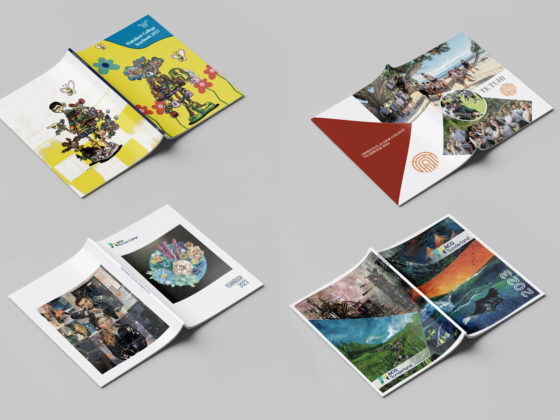
With so many moving parts involved in designing and producing a yearbook, it is very easy to get stuck with overcomplicated design, competing styles, and mistakes when it comes time to print. Here are Spacific Creative’s top 10 design rules to remember when creating a school yearbook.
1. Make Use of White Space
Also known as negative space, white space refers to the area between your design elements. Just because this space has no content, it doesn’t mean that it isn’t serving an important purpose! Having white space allows you to incorporate busy designs or large volumes of text without the added clutter. It provides spaces of relief within the page, making it easier to follow and focus on the important elements. If you are struggling with a cluttered page, try spacing your elements out for a more professional look.
2. Utilise Contrast
Contrast helps distinguish and bring focus to the important elements on your page. Contrast lets the reader know where to focus and in what order to view each element. Both high and low colour contrast are useful in design, depending on your goal. Use high contrast to emphasise an element or low contrast for harmony. High contrast should be used to differentiate text from the background so that it is easy to read. Try low contrast for complex background patterns, borders or busy motifs.
Your text should also display contrast. Pair ornamental typefaces with simple sans serifs, light with bold, and large with small. This will let the reader identify hierarchy and help maintain balance on the page.
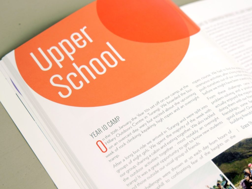
3. Have a Visual Hierarchy
The goal of a visual hierarchy is to show the importance of each design element to your reader. Hierarchy is established through a strong use of scale, colour, texture and boldness. Simply put, the most important elements should be the most eye-catching.
The eye naturally reads from left to right, top to bottom, unless directed not to. Either reinforce this natural bias or mix it up with your design choice. Make headings and subheadings larger and bolder than body text, and play around with colour. Highlight specific photos by making them larger or centred. Note that using whitespace around items will make them look important to the reader. Just remember to use a noticeable size contrast between your hierarchy levels to reinforce importance.
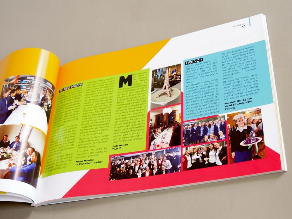
4. Balance Your Design
Design symmetry refers to the balance and harmony of the page. Symmetry is an important signifier of attractiveness in nature, and that carries through to design. Usually, this is balanced horizontally, with the left and the right side almost mirroring each other. Your publication doesn’t need to be perfectly symmetrical, but the weight should be equally balanced and distributed. If one side of your design has a heavy text component, this should be balanced on the other side with imagery or a design element of a similar proportion. When using a bright image on one side, use a bold, large heading to counteract on the opposite page.
Asymmetry can also be used but it must be intentional. Asymmetry can be used to draw attention to an element and to break up the monotony of your page layouts. Use this sparingly and only when it makes sense.
5. Stay Consistent
Yearbooks are long publications! They include many types of content including formal pieces and fun photo pages. This can cause the book to take on a variety of themes and styles if you aren’t careful.
Being prepared and setting expectations early on will help you create a yearbook that is consistent in both design and message. Put together a style guide for your book to follow, including your colour palette, fonts, borders, alignment rules etc. Try limiting your yearbook to three fonts and make sure to set sizing rules for headings and body text. You should be able to open any two pages and be able to tell that they are from the same yearbook. Make sure your message and tone remain consistent throughout your yearbook. Whether your yearbook is a fun lighthearted read or a formal keepsake, the tone and intention should be carried throughout. Articles should reflect the values and identity of your school, especially if it will be seen by prospective new students!
6. Make It Legible
Written content is an important component of your yearbook, so don’t make it challenging to read! Colour contrast is clearly an important factor of legibility. Your text should confidently stand out from the background. If opting for a busy, high contrast background, consider using solid blocks of colour behind your columns of text. Make sure to use fonts intended for body text and reserve ornamental styles for headings.
A clear hierarchy shows the reader what order to look at each element. Make sure to distinguish headings from body text through size and font choice. Capitalising headings can help to show hierarchy but avoid this technique for longer titles. Not only can this appear as if you are yelling, but it is also harder to discern between different letters when they are capitalised.
Reading a yearbook should be a relaxing experience, not an exhausting one. Large blocks of text and cluttered pages will exhaust the reader. Ensure your text is a readable size and consider using larger margins. Make sure your line length (also known as ‘measure’) isn’t too wide. Long, horizontal passages are tiring on the eyes. The reader has to stretch their gaze across the page and back and they may even jump to the wrong line!
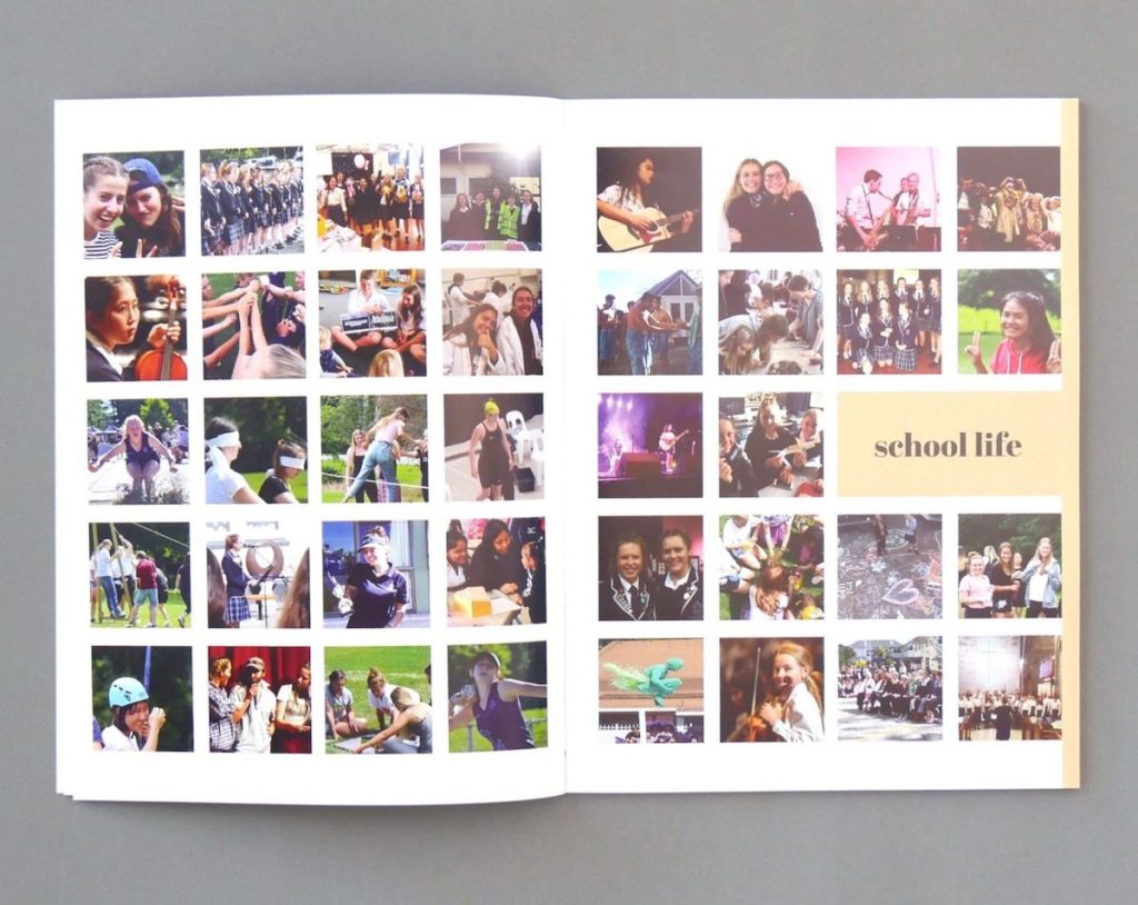
7. Gather Quality Imagery
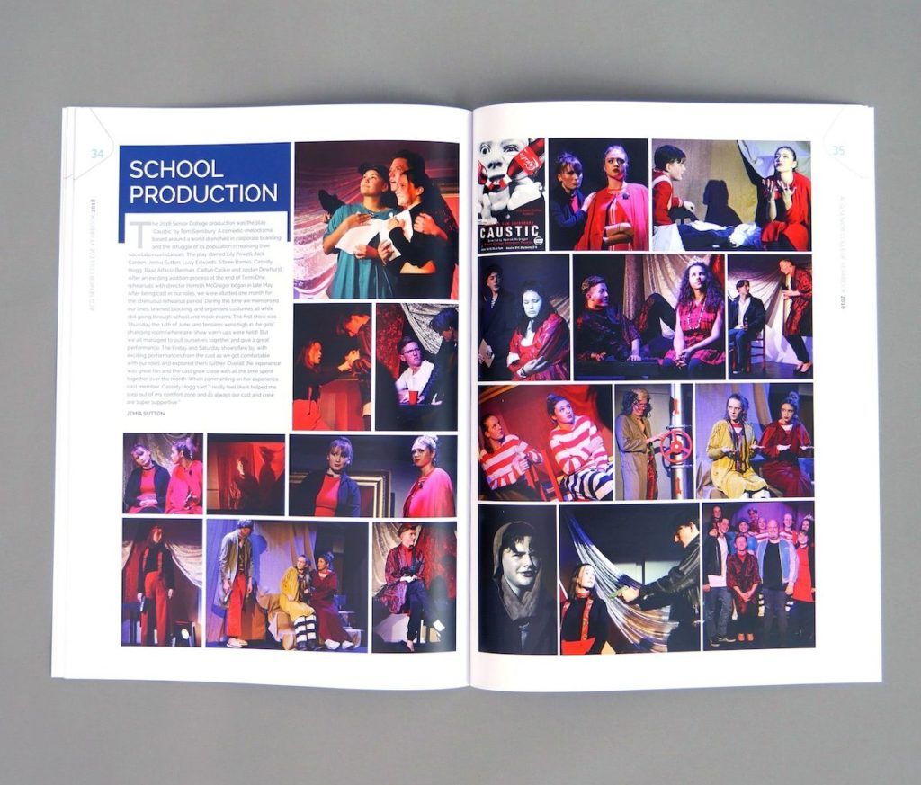
Don’t let your yearbook down with low-quality photographs! If your school has the budget for professional photography, it’s worth using this to capture important school events. Try to incorporate more photos of small groups over large groups. These photos capture faces and expressions better and are more captivating to look at.
Consider using fewer photos but make them take up a larger space on the page. This gives each photo the recognition and space it deserves while decreasing clutter.
Ensure the photos that you collect are of a decent size. A ‘rule of thumb’ is that a photo should be 300 DPI at the size you wish to print. If the file size is more than 1 MB then it should have a high enough resolution to use. Full-page images will need to be closer to 5 MB, while photos below 800 KB are usually too small to use for your yearbook.
8. Work for Your Medium
Not designing for your chosen medium can be the downfall of all your hard work!
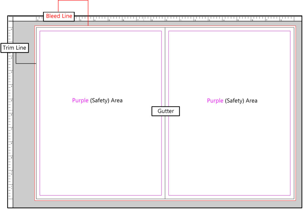
If you are designing a yearbook for print, you need to be aware of your gutters, trim and bleed. The gutter refers to where your important content should stop. Any content in this area is likely to be out of view due to the binding of your book. The trim and bleed help you print content all the way to the edge of the page (something you can’t really do on a home printer – ever noticed how it always leaves a white border no matter what you try and print?). Extend your backgrounds and photos out to the bleed margins when designing the page, and after printing with Spacific Creative, the pages will be guillotined on the trim margins, ensuring crisp edges with no white gaps.
Digital and print yearbooks have different guidelines and often require different file types. RGB colour is used digitally whereas CMYK is used in the printing process. Make sure to use the file type for your intended medium. DPI and PPI are also important terms to know. PPI refers to the number of pixels in a digital image whereas DPI is only relevant for printing, describing the number of ink dots for a printed image.
9. Align Your Elements
Proper alignment will keep your design organised and well balanced. Well-aligned pages are easier for the eye to navigate and will look polished and professional. Use a grid system to make this process easier. A grid allows you to visualise the breakdown of the page into halves, thirds, quarters, or even sixths. This helps you arrange your photos and text inline and maintain the structure of the page.
Aligning type can come down to personal preference and the format of your design. Left-aligned text is the easiest to read and to format and provides a more casual look. This is a good choice for long passages of text, and it is accommodating of difficult fonts.
Justified text is popular in glossy magazines and is widely used for newspapers. The style is also used often in yearbooks. This professional style looks symmetrical and square, which makes for a tidy design. Try justified text when using multiple columns with a narrow margin (much like in newspapers). This style can require some adjustments to your text as it is prone to spacing issues.
10. Keep It Simple
There are so many exciting styles to try out, but pairing them all together is rarely a good look! Simple design provides you with a modern and more confident look. A restrained design is easier for the eye to follow and understand. There is a reason why simplicity is used by most successful, strong brands; design should not distract from a great product or your great content!
When planning your publication, ask yourself what design you wish to explore and highlight. If using bold or jarring colour combinations, pair with negative space and simple type. When incorporating fun display fonts, consider limiting the colour palette.
Remember, quality over quantity is best for a polished, readable yearbook.
What design rules do you swear by when producing your yearbook? Tell us below!