A cohesive colour palette plays a larger role than just making a page look pretty. Maintaining consistency with colour ensures that your design flows from start to end.
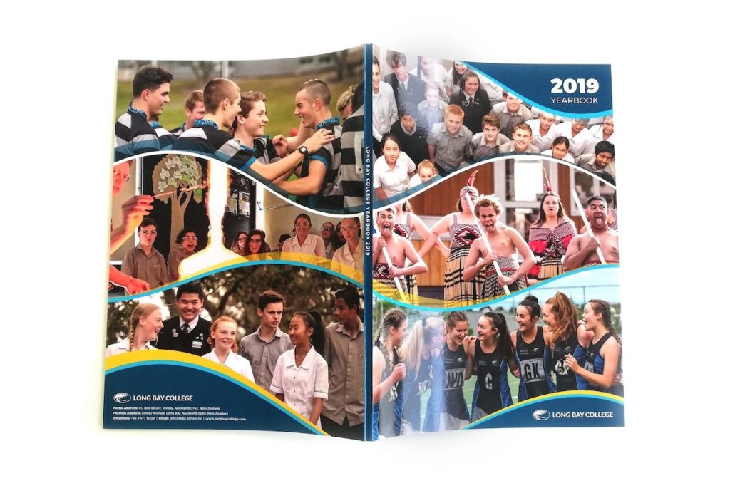
For yearbooks, a good source of inspiration is your school colours. Consider a colour palette that uses these shades if your yearbook is more formal or will be used as a marketing tool for prospective students.
If you have more free reign or would like to get creative, you are going to need some inspiration! Creating a colour palette without a starting point is challenging, but luckily there is inspiration almost everywhere! Oftentimes a pretty photo is all it takes!
Here is a selection of colour palettes to try out or take inspiration from for this year’s yearbook.
Pink Sunrise
The colours in this palette are bold but harmonious and can be used to achieve a gradient or overlay effect on your page.
This colour combination is great if you want to inject energy but maintain tranquility.
City Lights
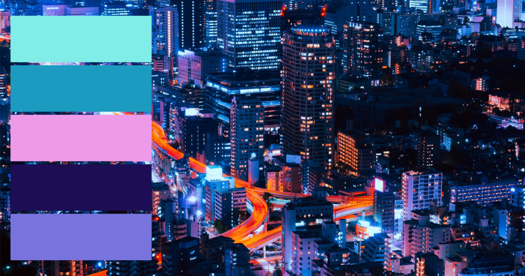
This combination of colours is reminiscent of city lights at night. The cool-toned shades are electric and contrasted.
This palette is popular in futuristic and dystopian design. Try it out for a fun yearbook!
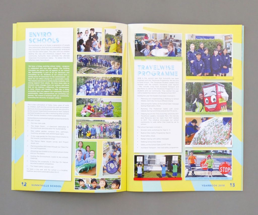
Natural Greens
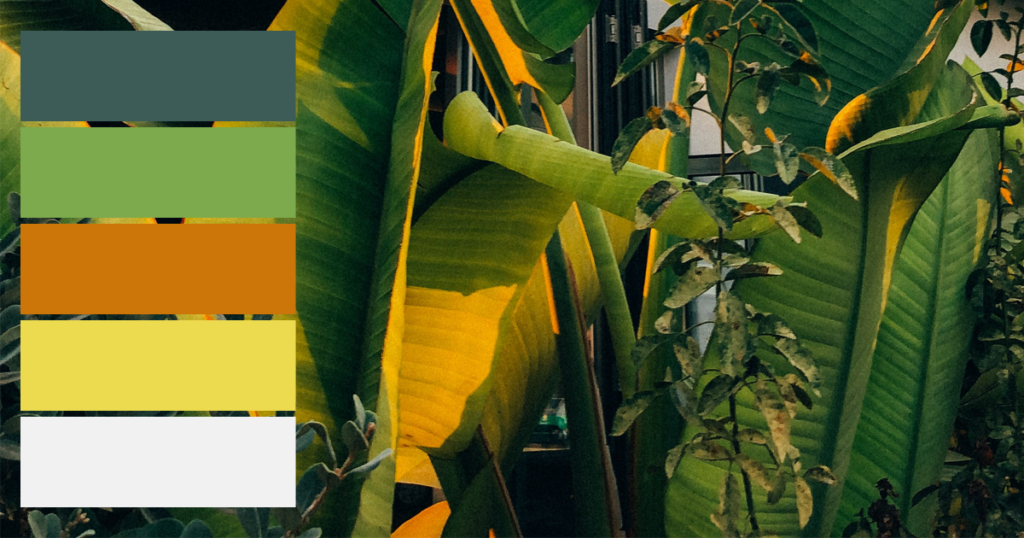
Green is symbolic of growth and tranquillity, which makes it the perfect choice for a school yearbook.
This colour scheme is welcoming and relaxing but uses contrasting shades to make it pop!
Deep Floral
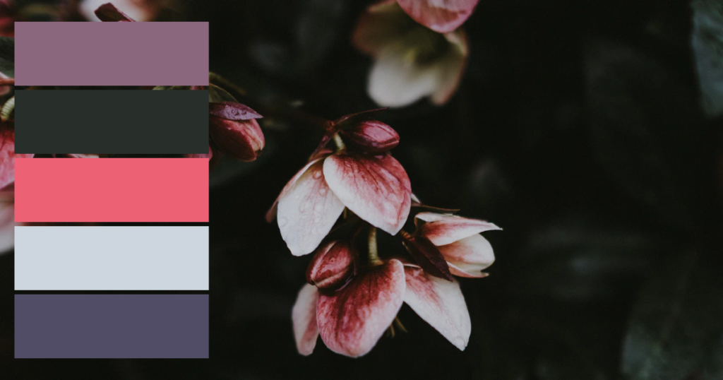
This colour scheme is feminine but subtly so, with soft mauves and grey tones to keep it subdued.
This palette is versatile and can be appropriate for both informal and formal publications.
Pastel Shades
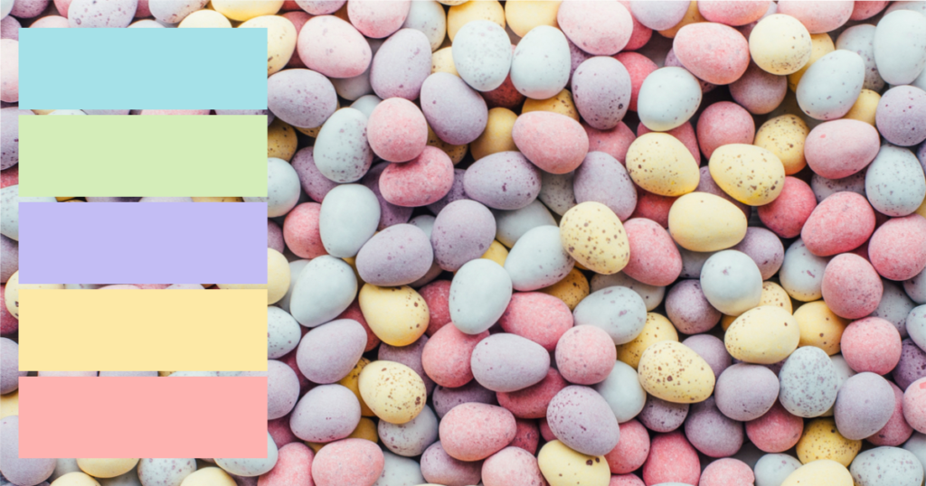
Pastel colours are calming and provide a feeling of relaxation for the reader.
The shades in this palette still contain enough saturation to pop from the page and create contrast.
Ocean Blues
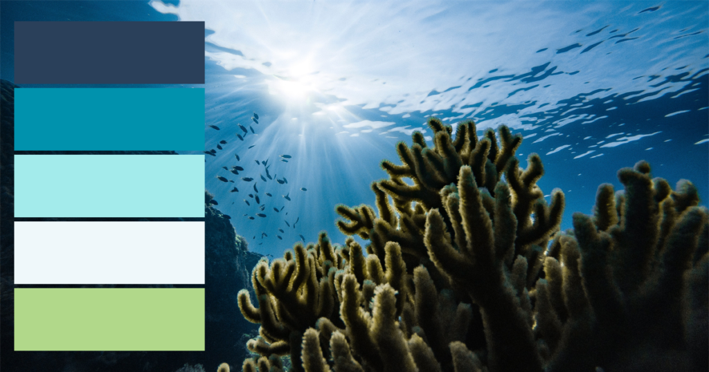
There is a reason that blue is a popular school colour! Blue is versatile and is a great choice for both formal and informal designs.
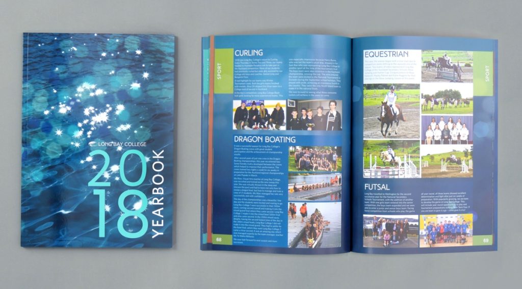
This palette includes complimentary blues from dark to light, with a pop of green!
Bright Rainbow
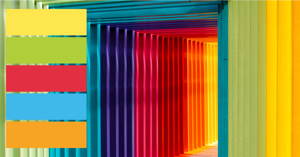
For a confident and eye-catching publication, why not try a rainbow colour theme?
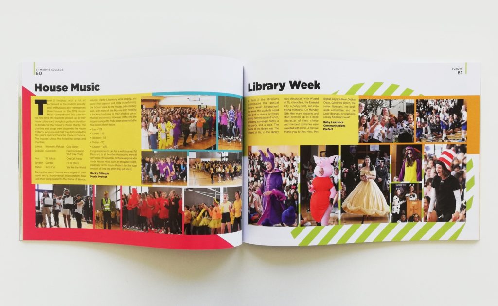
As these colours command attention, it is best to keep your other design elements simple. This palette lends itself to simple, flat designs and sans-serif fonts.
Natural & Professional

Muted natural tones are perfect for a sophisticated publication.
These colours are calming and earthy, and won’t distract from your page content.
Citrus Fruit

Like citrus, this palette is fresh and full of zest!
This colour combination will give your yearbook a happy and sunny look.
Retro Orange
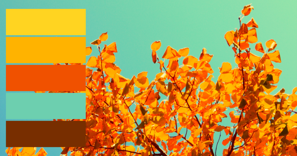
This retro inspired colour palette is a unique alternative to the more typical bright shades.
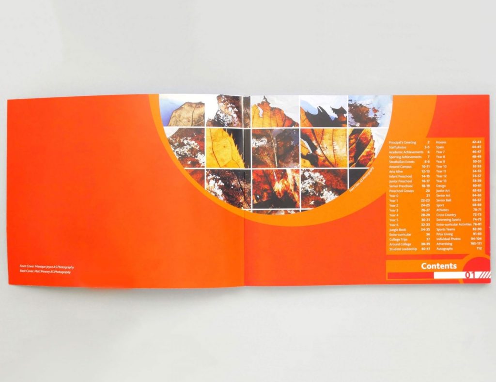
Orange is unexpected and less common in yearbooks than blues and greens. Try this combination if you are after a yearbook that students won’t forget!
For more colour palette inspiration, check out our Pinterest board or check out what shades are trending in 2020!