Fonts are like people – each one has a unique personality!
Your font choice is a crucial element of your design style and will play an important role in setting the tone of your content. Your text style should match the publication type and the message you wish to convey. But how do you choose wisely when there are so many options?
Keep reading to learn how to choose and combine fonts for a polished and cohesive look!
Typefaces
There is a lot of variation between fonts, and different styles serve different purposes. While not all fonts are easy to categorise, there are a few typical styles that you should be aware of. Below are some different typeface categories that you will come across.
Serif Fonts
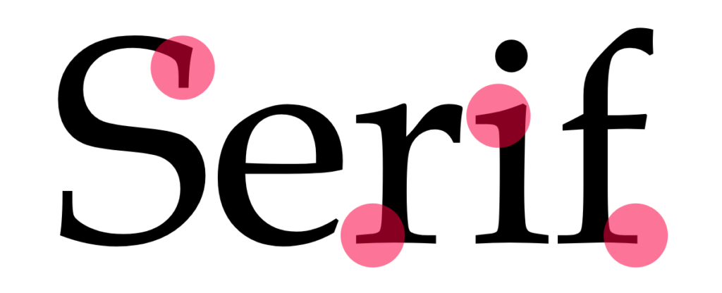
Serif fonts are the most traditional and have small divots at the end of each letter. These divots help to make each letter more distinctive and recognisable to our brains so they are easier to read. You will commonly see serif fonts being used in novels, newspapers, or for large bodies of printed text.
Sans-serif Fonts
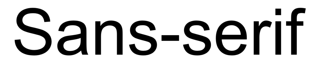
Sans-serif fonts, without the small divots, have a more modern feel. They have long been popular for web design, largely because the lower resolution of computer displays historically made small serif characters harder to read. Although computer displays have come a long way, this may still be something to consider if you are releasing a digital yearbook!
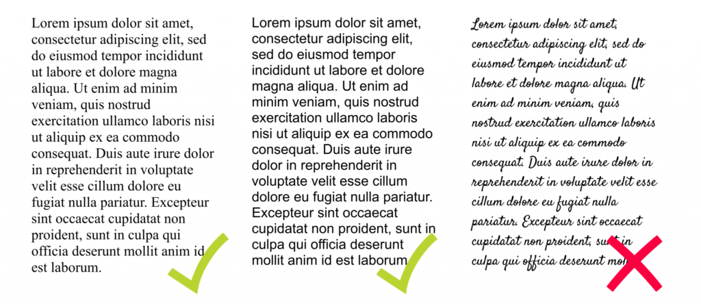
Script Fonts
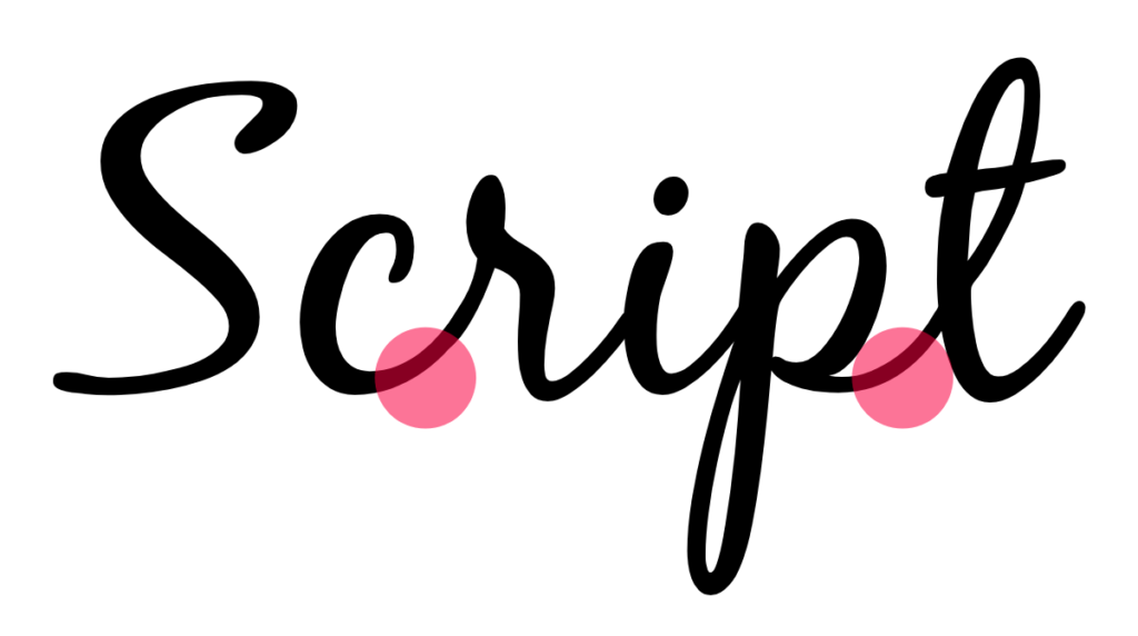
Script fonts appear fluid, like cursive handwriting, and can help you achieve a formal, elegant look. Although they are attractive, reserve script fonts for your headings and subheadings as they can be challenging to read.
Display Fonts
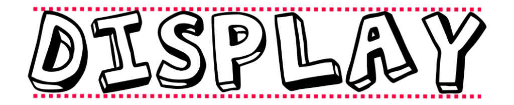
Display fonts are another style that is best for headings, as they are difficult to read when small. They are often eccentric and are less uniform across the different characters. Letters may not appear inline or could be all caps. These fonts are bold and great for commanding attention!
Font Pairing
Have you found a font you like but want a bit of variation? Using multiple fonts can look great, but it can require some trial and error.
Achieve a cohesive look by choosing fonts that look contrasting but also share similarities. They should look different but shouldn’t compete for attention on the page. Consider an embellished script or display font for headings and keep the body text simple with a serif or sans-serif. Ensure that your fonts have a similar ‘personality’ that matches the tone of your publication.
There are lots of articles that suggest good font combinations if you’re struggling. Try Canva’s font pairing tool if you’ve found a style you like and are looking for something compatible.
Font Families
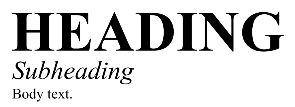
Sticking to font families is a good way to ensure consistency. Fonts within a family are designed to work well together. Consider using Bold for your headings and Italic for subheadings or to highlight quotes or names.
X-Height
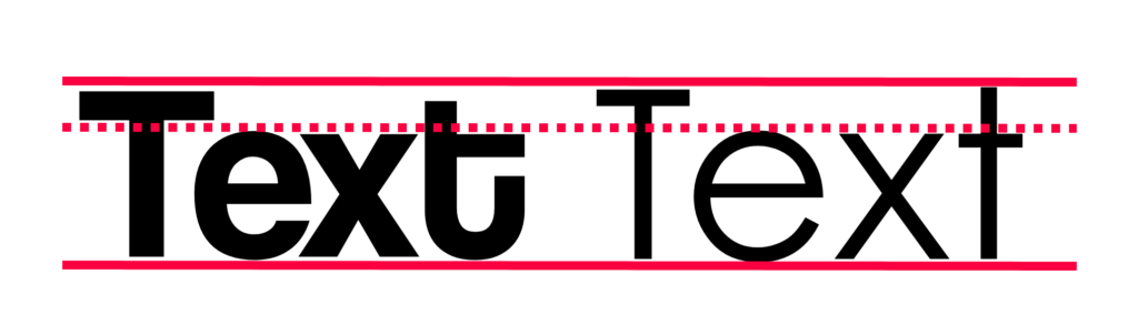
One test to check if two fonts are compatible is to look at their x-height. The x-height is the distance between the base of the text and the top of the lowercase letters. If your fonts have a similar x-height, this suggests that they will work well together. This test isn’t foolproof but is a good technique to try.
Font Trends for 2019
We have selected a variety of exciting typefaces that are on trend for 2019 for you to incorporate into your publication.
Abril
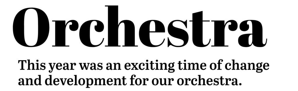
After years of chasing simplicity with clear sans-serifs, serifs are back in style and being praised for their individuality! Abril is a modern serif that is full of personality. There are different Abril fonts that are suitable for headings, subheadings and even body text. Utilise the font family for cohesion, or pair with sans-serif body text for a sophisticated, formal look.
Barlow
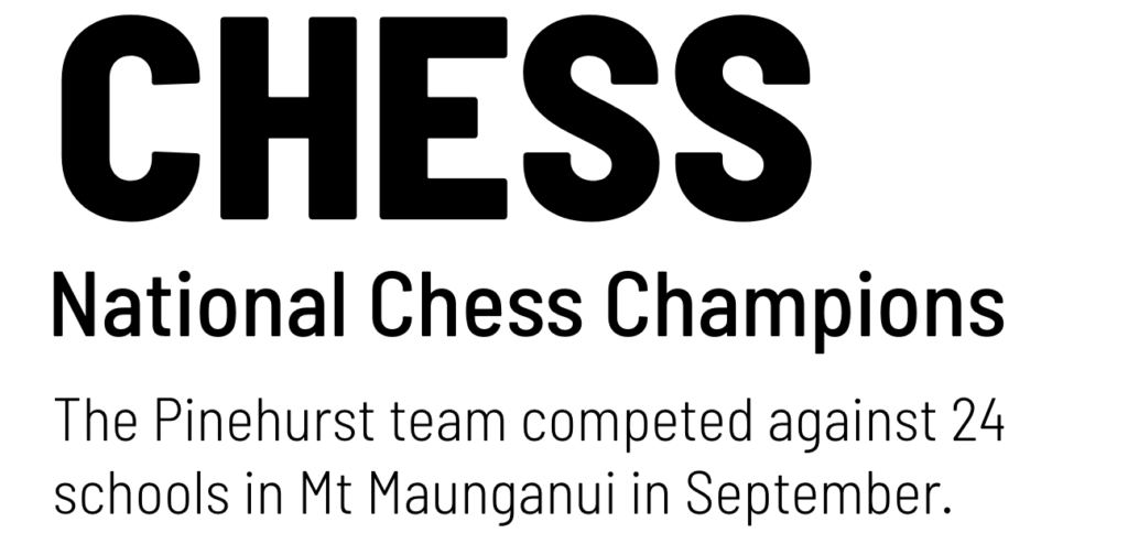
A good sans-serif always comes in handy when you are after a simple, non-distracting look. Barlow is a typeface with a lot of variety. It offers a wide range of font styles including Condensed, Extra Bold and Italic. This makes it a great choice if you’re looking to keep all text within the same font family, but want to branch out from Arial or Helvetica! This clean, sophisticated font is very versatile but would be great for a digital publication.
Metropolis
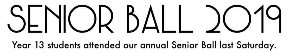
This font is an art deco typeface that is all-caps and great for headings. As we near the centennial for the roaring twenties, there has been a real comeuppance in the geometric and ornate style. Metropolis would be great as a heading for a school ball or special event. Pair it with a typeface like Futura to keep the 1920s feel!
Bobby Jones
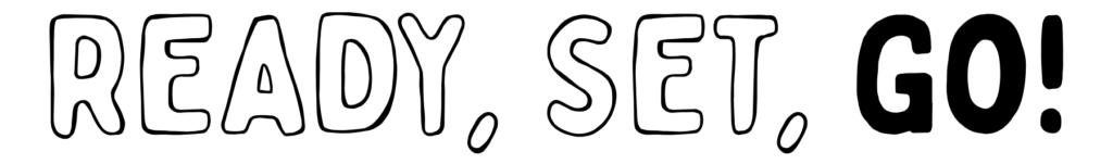
This display font is quirky and full of personality! Choose from Regular or Outline, or pair them together for contrast. This would be great for a publication that doesn’t take itself too seriously.
Cooper Black
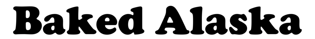
Retro, nostalgic fonts are currently having their moment, as we are seeing a strong resurgence of 70’s style serifs. Cooper Black is an ultra-bold serif, which although dates back to 1919, was a popular choice for album covers and TV shows in the late 60s and early 70s. Try it for headings in a cookbook or calendar.
Colortube

A slightly less practical, but very fun display font is Colortube. This lowercase font incorporates geometry and colour overlay and would be great for a primary school yearbook. Just make sure to reserve this for headings!
Trust Your Gut!
Choosing fonts for your publication should be a fun task that helps reinforce the purpose of the content. So trust your gut and test out some different combinations!
Check out our Gallery for more inspiration.