Yearbook content may be static and two-dimensional but that doesn’t mean it needs to look that way! Creating the illusion of movement helps to carry the reader through the yearbook with ease.
This article explains how to capture motion in both images and articles, bringing life and energy to your yearbook.
What Is Visual Movement in Design?
Movement in design refers to how the viewer looks at and absorbs the material. Well-designed work should create a visual path for the viewer, that guides the eye through the content. Hierarchy, lines, shapes or other illustrative techniques all help to establish this. Movement is an important design technique for ensuring the book feels ‘alive’. A yearbook that recognises the importance of movement will create a more impactful and tangible experience.
Movement in Images
Images with movement provide a more immersive experience, and let the viewer feel like part of the scene. Perceived motion adds to the impact of an athlete running or a ball being thrown.
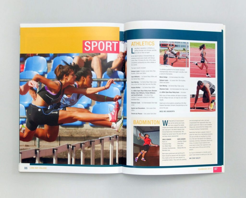
One way to achieve this effect is with suspended movement, where the action of the subject is in a position that defies gravity. Whether they are jumping or twirling, the viewer knows this is not a position in which a person can be static.
Blurred lines or backgrounds can also help to reinforce motion. A photo of a car, for example, may look the same when it is still or moving. A blurred background implies that the image was captured at speed.
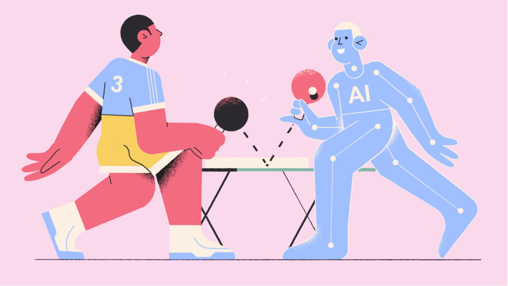
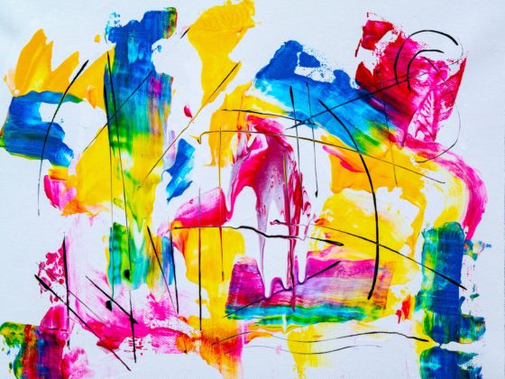
Movement isn’t limited to photography, and definitely has its place in illustration. Motion lines or ribbons can imply movement when placed behind an object, which indicate where the object has travelled.
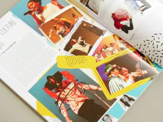
Open composition is a popular design trend, where the subject matter doesn’t stay within the confines of the page. This causes the brain to feel like there is movement beyond the canvas, and can also encourage the reader to flip to the next page!
Movement in Writing
The reader should be able to navigate each article with ease and understand where it starts and ends.
Establishing a good visual hierarchy helps with this process. A visual hierarchy uses design to distinguish between headings, subheadings and body text. Text that is larger, bolder or makes use of a funky font will grab the most attention. Reserve these styles for headings, or where you want the reader to look first. Subheadings should be less commanding than headings, and body text small and clear. By doing this, you are able to guide the reader through the piece, from most important to least important.
Use paragraphs generously, especially in larger pieces of text. Using paragraphs helps to break up your ideas, and gives the reader time to breathe. Starting a new paragraph emphasises moving to the next point. It helps the reader to not get ‘stuck’ or confused about where they are in your writing.
Visual difference keeps the content moving by breaking up the monotony. When every sentence is the same, the reader may get fatigued. Mixing up your sentence length is an effective method to avoid this. Follow long, detailed descriptions with short, to-the-point sentences. Varying up your sentence length provides a ‘rhythm’ to the piece.
When every sentence is the same, the reader may get fatigued. Mixing up your sentence length is an effective method to avoid this. Follow long, detailed descriptions with short, to-the-point sentences. Varying up your sentence length provides a ‘rhythm’ to the piece.
Keep your writing concise and clear. Remove unnecessary words or sentences to ensure the reader stays focused.
Movement in Yearbook Design
A yearbook that holds the reader’s attention from start to end requires clever design. Visual movement gives ‘rhythm’ to the reading experience and encourages the reader to flip to the next page.
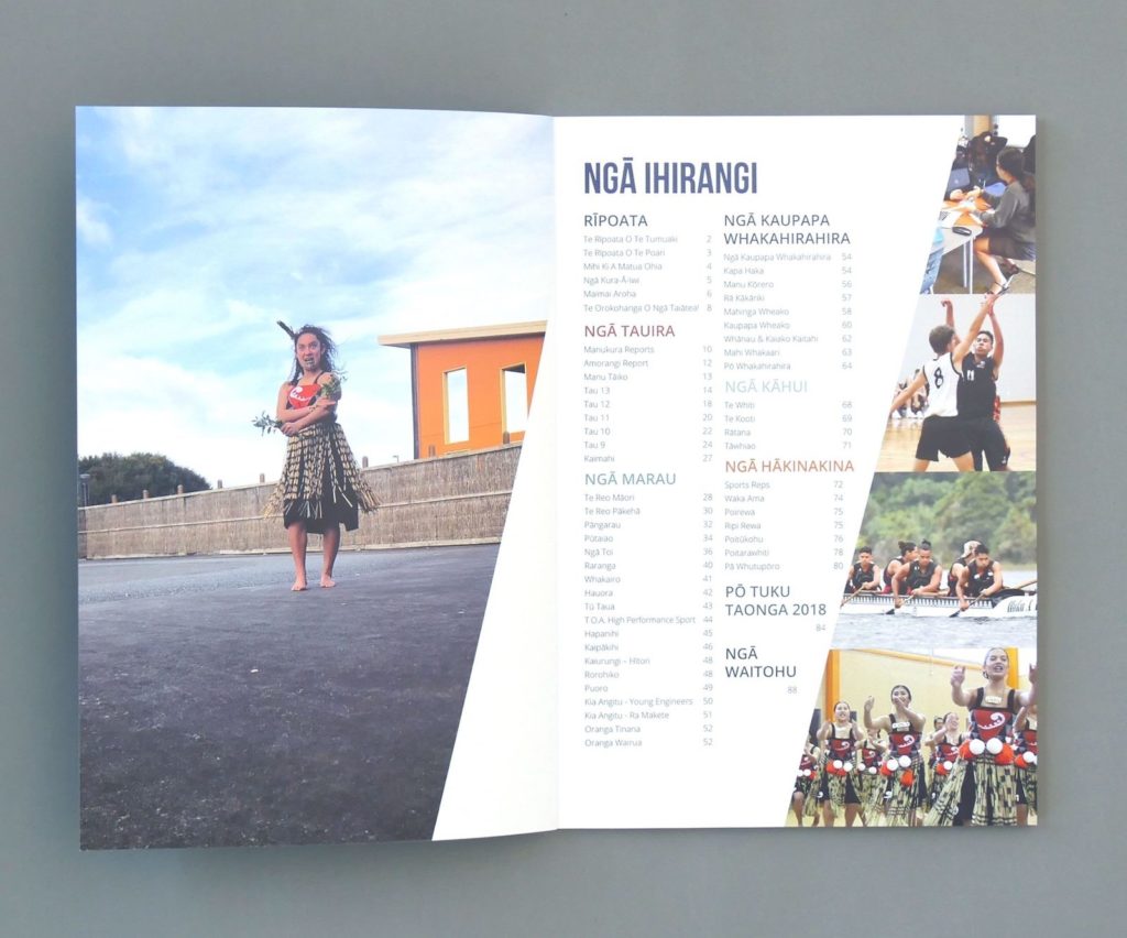
The arrangement of content affects the story being told. Overarching topics, updates and the Principal’s Address belong in the front. These set the scene and give your reader the most important information first. Stories from events, faculties and camp trips, along with school photos, should follow. A table of contents along with page numbers helps the reader navigate and refer back to important content.
Unexpected pages that vary from previous content can be used to avoid monotony. Artwork and photo collage pages can provide relief in the middle of the book. This is a good way to break up clusters of articles and avoid reader fatigue.
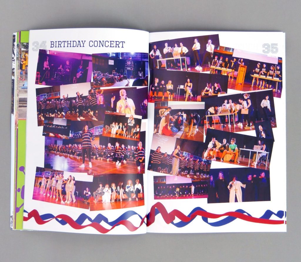
Repeating motifs like backgrounds and borders helps the reader move through the yearbook. Consistency creates harmony and uniformity, to reinforce the story you are telling. Try out patterns that flow or look like ribbons or painted strokes for added visual movement.
If you are unsure if the yearbook has movement, visually scan the pages and make sure you don’t get ‘stuck’. If an element is too bright, bold or large, it can disrupt from the natural navigation of our eyes. Flick through the pages and adjust where necessary!